In a little celebration of my new logo, I decided to create a series of images that reflect my brand and style of photography.
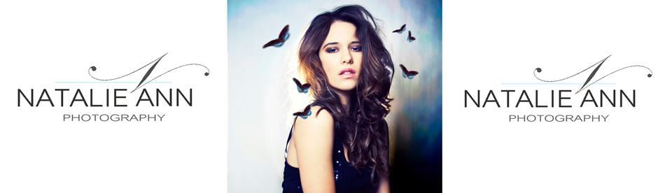
I wanted my logo to be modern, but with a symbol that reflects me. So after going through many many fonts, I found one that was perfect! I used this font for the N to create my 'symbol' (and it sort of looks like butterfly antenna's, don't you think?) It was perfect, because if you have noticed, my current image that I use against my logo is the self portrait with the butterflies. I also wanted to add a touch of colour and what better colour than Tiffany Blue.
I thought I would share my thought process for when I'm designing an image after I've taken the photo. I took these photo's in my studio using back lighting and a light at the front using a shoot through umbrella & reflector.
I wont be going into full detail of how I used photo shop, just a basic step by step. I go through this same process for all my clients' photographs. Depending on the image some are more extensive then others.
Step 1 - After adjusting the image in bridge, I then open it in photo shop. I then just sit for a moment looking at the photograph and deciding what I want out of it. I chose this particular image because it was very simple and I wanted to challenge myself into making it interesting.
Step 2- The first thing was clear - too much red! So I used curves to reduce the red tones.
Step 3 - The next thing to do was a little re-touching. I used the liquify tool to make the hair bigger, and used the burn tool to darken the eye brows. Eye brows are important as I believe they are like the frame for the eyes. I also lightened the eyes and added highlights to the hair.
Step 4 - The image was looking a bit flat, so I then added highlights to the skin and changed the colour tones.
Step 5- To make the image 'pop' I used 'overlay' at 40% and erased the darker areas to bring back details in the eyes and hair. By using the overlay it provided some contrast. I then added colour to the image using the vibrancy & saturation tool. The next thing I did was to sharpen the image using the unsharp filter.
Step 7 - Since I was trying to make this simple image interesting, I wanted to do something with the background so I dropped the curves right down to bring out the darker tones which in turn brought out blue colours around the edges.
I then continued to adjusted it, playing with the curves tool to lighten & darken areas that apealed to me.
Step 8 - I will then usually convert the image to black & white to see what it looks like and if I prefer it.
Once I am happy with the image, I will add my own style to it. Using some photo-manipulation skills, I added butterflies, (since they're my thing at the moment) and again trying to reflect my style and brand.
Here is my final image:
xxxx